Thursday, 1 December 2011
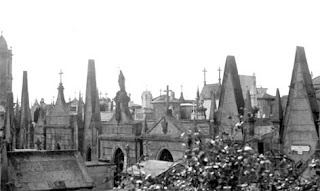
Portugese cemeteries
I know it seems quite random and rather depressing but after looking into intriguing architecture I discovered some really beautiful cemeteries and leanrt that the Portuguese take great pride in their burial sites. Hers a few examples:
Back on Blogger!
I've recently neglected my blog as I discovered Tumblr, however I've quickly realised that I much prefer the ease and style of blogger so I'm back with my most recent project: CULTURAL IDENTITY.
The task was to research into the cultural aspects of Portugal and bring something into Manchester, i.e. food, music, crafts, architecture, etc.
The task was to research into the cultural aspects of Portugal and bring something into Manchester, i.e. food, music, crafts, architecture, etc.
Wednesday, 4 May 2011
Pictures of my final model
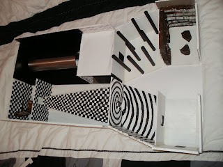
The following images are all those of my final model. It is at a 1:50 scale and shows the dimensions and form my final design will take. I found a great sense of achievement at finally finishing such a big piece of work and felt it portrayed a lot of my original concept. The only problem came about due to a stupid mistake in which i created the second half of the model on the wrong half of the wood therefore they do not fit how I originally had planned them too.
Model
Next it was time to design my model. I decided the best material was wood as I could out it into a s hape that I desired whilst still being a sturdy and solid material. I also wanted to use a bit of metal and although I new it would be time consuming I wanted to hand paint each of the rooms.
FloorPlan and Elevations
I created both floor plans and elevations of what I wanted my space to look like, this was done using vectorworks, a new system that we were currently taking classes in. The images i created would not load onto my blog for one reason or another however they are displayed on my sketchbook and on my banner. They highlight the key feautues of the space and became very useful in discovering the dimensions of teh space as well as the layout, frm and journey my design would create.
Emotive video
I enjoyed creating the previous movies in order to express my concept and space, I then felt it appropriate to create another video that would be something similar as to what was displayed in the emotive tunnel. Therefore you can get a better idea of how the participant is going to feel. This video was made on iMovie, using a series of heart felt, disturbing and empathetic images.
Monday, 21 March 2011
Where do I want my space?
This week I've began to work form the inside out, and think a bit more about the exterior of my space and where I want it to be. The idea of the space being hidden underground was prominent for many reasons, firstly I like it being hidden, like the emotions are hidden and discovered through the journey of the exhibition. Secondly, it relates to my original concept of the Alice in Wonderland, whimsical feel and gets the participant involved immediately. Some kind of bunker would be ideal for my space.
Tuesday, 15 March 2011
Room Design: Reading Salvation
The final space, the reading salvation, will be the end of the exhibition, where the participants will be able to relax and discover the underlying emotions and feelings explored throughout the other rooms. This is where Lucy will be providing help via Bibliotherapy, and reading in a calm, welcoming space.
Room Design: Hazed Maze
The penultimate space in my exhibition will be a clouded room, inspired by Anthony Gormely. Where the participants will be required to find their way out into the next room, avoiding the looming black pillars placed around the room creating the illusion of a maze. Hopefully the space will make people feel lost and scared and the desperation to find their way out.
Room Design: Endless Faces
After the tunnel emotion comes a room of endless faces, which is so the participants feel insecurity and fear from all the eyes watching them. The walls will be lined with the plain white ominous masks, the the floor ceiling will be mirrored in order to create the endless effect, with a walkway down the centre.
Room Design: Tunnel of Emotion
The fifth space is one of the most crucial in the entire experience. The tunnel of emotion is designed to complete isolate the participant and make them feel a series of emotions through imagery, almost the way subliminal messages work. I've created a video that evokes, angst, fear, panic, confusion, etc, this will be uploaded to my blog at a later date. Basically you walk through the tunnel and the images are projected around it.
Room Design: Disproportional
The next space is Alice and Wonderland inspired and makes the person feel directly very small and insignificant in the space. This is done by placing oversized furniture and objects in the space along with the use of the chequered design, therefore dwarfing the participant.
Room Design: Narrowing Corridor
The third space will really play with the mind, as not only will the chequered design baffle and confuse people, but subtly the corridor will narrow and the participants will be forced bend, crouch and crawl in order to reach the next room. This will make them feel disorientated, trapped, and really get them involved within the space.
Room Design: Optical Illusion
The second room will be designed to make the participant feel confused and disorientated. To do this I've created sloped walls and unusual angles in the space, also it will look as though it spirals into a black hole by the way its painted and designed.
Room Design: Foyer
The Foyer is the first room in the exhibition and it is here where the participants will be asked to place white overalls over their clothes, in order to really blend them into the experience. The room will have several doors in however only one will actually lead into the next space.
Monday, 14 March 2011
Playing about with Size
I wanted to make a room that played around with proportions, in order to confuse the participants of the exhibition. I looked into miniature rooms that make you feel giant, however I wanted to make people feel small and insecure therefore I would do the reverse of these pictures, and make oversized furniture to dwarf the exhibitors.
Wednesday, 9 March 2011
George Rousse
 Another artist that I looked at was George Rousse who was suggested to me by my tutor. He is a photographer who plays around with sculptures and paintings within a space
 , usually he works in derelict buildings, which creates a great contrast to a lot of the colourful and intriguing work he creates. It relates to my own project because his work is like an optical illusion, and he piants things in certain ways and positions that you only notice the image he's trying to create from a particular perspective. I also love how it almost looks as though it has been digitally done, A really great aspect that I could play around with in a room possibly in order to disorientate the participant.
Tuesday, 8 March 2011
Willy Wonka
I was contemplating my idea and the different areas of space that I want the participants to travel through. One of my ideas was a tunnel that you walk through that displays emotive images, making you feel a certain way. it's hard to explain and the closest reference I can think of is the boat ride thats on the original willy wonka and the chocolate factory.
I also then thought about the tunnel you go through in a funhouse that also displays images along the walls.
Monday, 7 March 2011
Shanghai Sightseeing Tunnel
In July 2010 I was in Shanghai, where I went on the Bund sightseeing tunnel. Its kind of like a ride/form of transportation as an interesting way to get across the river. The tunnel runs under the river and is all electronically run; it consists of pods that move along a track and images and lights a displayed inside creating a visual treat. I thought it linked into my idea as it was an experience that disorientated, confused, yet intrigued the participants. The imagery and effects used are something I want to look at in my own space.
Anthony Gormley
Whilst looking into emotive imagery I've stubbled across a great artist, with a really interesting exhibition at the Southbank centre. It's called the 'Blind Light', there's a link below explaining it in more detail, but the part I particularly like is the clouded filled room that people can walk through the space and feel lost alone and disorientated. I can't believe I've found such a perfect reference as to what I want to create in my own space.
http://www.southbankcentre.co.uk/minisites/gormley/light.html
http://www.southbankcentre.co.uk/minisites/gormley/light.html
Melbourne museum
There was na exhibition in Melbourne Museum last year that I went to that was all about the mind and the labyrinth of how the mind works. There was one bit in particular that I remember where you stood isolated, watching various images and clips on a screen and each made you feel something different. It's hard to really explain, but it's something I now can't stop thinking about and I really want to use something like that in my space in order to make the participants feel, certain emotions, ie scared, lost, confused.
Monday, 28 February 2011
Op Art
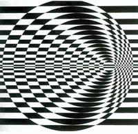
Through my research into optical illusions and mind tricks I've discovered that there's actually a form of art 'Op Art' or Optical Art, that is widely known and is lead by people such as Bridget Riley, a London artist, where all the images shown are taken from. It's certainly something I want to explore and experiment with in and around my exhibition space.
More about unusual staircases
I came back to looking at staircases as I wanted to explore invent ways of getting people to different levels in the exhibition. These images are created by several different designers but I particularly like the image to the right, created by Levitate Architects, as they also incorporate books, which links into the Bibliotherapy work of Lucy.
My videos uploaded at last well sort of
Here is my channel to youtube still can;t seem to get them on here yet. I'll keep trying
http://www.youtube.com/user/laurendean90
http://www.youtube.com/user/laurendean90
Subliminal messages
I chose to also look into subliminal messages and eye tricks, for several reasons. First of all its an extension of the idea of playing with the mind, secondly I thought it would be interesting if I could display subliminal messages somehow through the exhibitions in order to make the participant discover feelings and emotions that may be hidden inside them.
http://vimeo.com/10178189
Optical Illusions
I've recently been looking more into optical illusions and how to play about with interior space in order to make the viewer feel disorientated. Here are several images that I found that display the kind of concept that I was looking for. All play about with the space and in particular I like the use of the painted walls that confuse a spectator and make the space seem not as it is in reality. Also the use of stairs is imperative in my space as I want to be able to explore different levels in an unusual manner and make the visitors of the exhibition, active members.

oooops!
I've not posted any blogs over the past week which is bad and there's no excuse however its because I've been struggling to upload my video, and I've been more focused on creating the video and more hands on work like sketches and making my own ames room instead although there's not really any excuse.
Thursday, 17 February 2011
Learning how to use iMovie
On Tuesday 15th February we learnt how to use iMovie. As I'm new to my MacBook it was a much needed lesson. I imported the movie I'd created of walking around a maze, and cut it, changed the visual effects, changed the speed, rotated it and added in sound clips to create an eerie video.
Tuesday, 15 February 2011
How my Idea has Developed...
Originally I wanted to create an exhibition space for Lucy's 'reflect forward' collection. Howvere after extensive research and analysis into my reponse to her work I now want to create a space more linked to Bibliotherapy. However, I don't want to create a permanent space, or even work with the transient space that Lucy provided, I'm possibly looking at creating some kind of exhibition promoting Lucy's work and the process of Bibliotherapy.
To do this I want to take people on a journey, allowing them to feel lost, disorientated, helpless, intrigued, a whole host of emotions that leads them to a deeper understanding of Bibliotherapy.
To do this I want to take people on a journey, allowing them to feel lost, disorientated, helpless, intrigued, a whole host of emotions that leads them to a deeper understanding of Bibliotherapy.
Monday, 14 February 2011
Another illusion
After looking at the mirrors and the ames room I started looking at other ways to create an unusual illusion in a room. That's when I came across the upside house that had every room inside seemingly upside down. It was an interesting way to literally turn a room around.
Subscribe to:
Comments (Atom)


