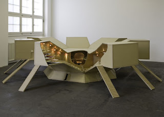
The images on the left are the works of Atelier Van Lieshout. There were so many pieces of work that I liked however I chose to display these ones as I feel they link in with the brief, and my response to Lucy's work.
The first, resembling a tree, gives me the impression of enchantment but with a sinister twist, and it looked like something that Lucy would appreciate.
Although this was a design for a Male Slave University the concept behind it was what intrigued me. I liked the use of different levels and creating isolated areas.


No comments:
Post a Comment